Per ESPN:
The Carolina Panthers have a new look.
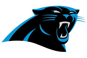
For the first time since joining the NFL in 1995, the Panthers have changed their logo. According to a press release Sunday night, the logo has been designed to provide a “more aggressive, contemporary look to the logo while making it more three-dimensional for ever-increasing digital use.”
The Panthers will transition to the refined logo throughout 2012.
The primary tweaks made by the creative department of the NFL are primarily in the eye and mouth, where the features — particularly the muscular brow and fangs — are more pronounced, giving the panther a more menacing look. The new logo has a darker shade of blue over the black logo, compared to the former logo, which had teal on top of black.
“We have one of the finest and most recognizable logos in the NFL and wanted to make it as modern as possible without losing the dramatic essence of the mark,” team president Danny Morrison said.
Cool design - wonder if the person who created it went to a graphic design college.
The team also will change the primary logotype.

